History of the Doves Type
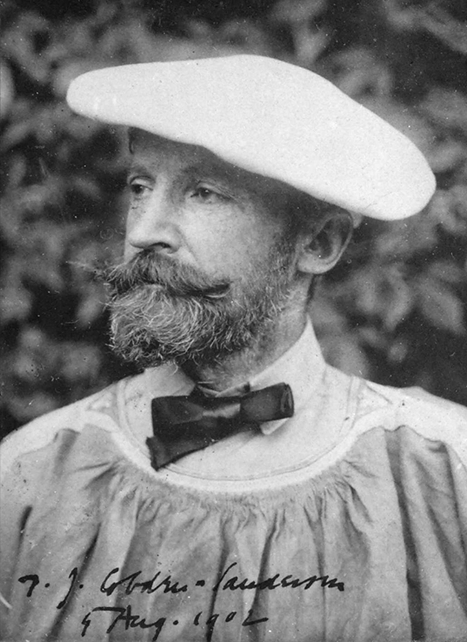
Thomas James Cobden-Sanderson along with partner, photographer and engraver Emery Walker, established the Doves Press in 1900 by the banks of the River Thames in Hammersmith, London. Cobden-Sanderson’s stated intention for the Press was, ‘to attack the problems of Typography’.
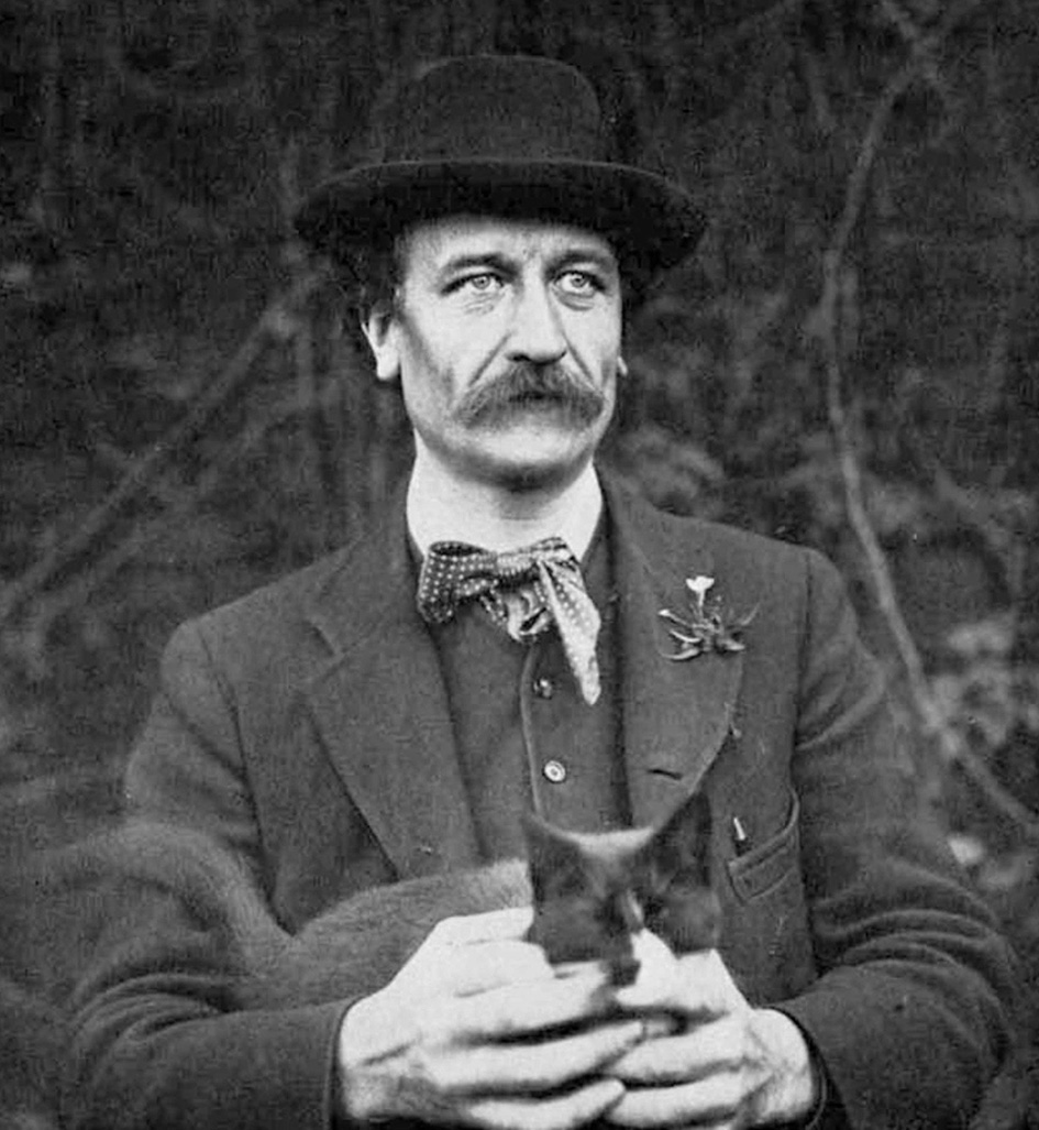
Preparations for the new venture had begun the previous year, with Cobden-Sanderson commissioning a bespoke typeface in 1899. Under Emery Walker’s supervision the type would be produced in one size only, ‘two-line Brevier’ (equivalent to 16 pt). Its design would be based on late 15th century letterforms by Venetian printers Nicolas Jenson and Jacobus Rubeus. These sources were identical to those used by William Morris for his Golden Type. Embarking on the design process, Walker chose to reuse the same enlargements he had prepared a decade earlier, while assisting Morris at the Kelmscott Press, of books printed by Jenson and Rubeus from Morris’s own collection.
Percy Tiffin, an employee at Walker’s photo-engraving firm, Walker & Boutall, was charged with creating new drawings of Jenson and Rubeus in accordance with Cobden-Sanderson’s rather different vision. Cobden-Sanderson’s priority was ensuring his typeface did not distract the reader from ideas within the text itself, ‘the thing intended to be conveyed’ as he put it. Morris’s sensibilities had led him to render heavy strokes in his Golden Type, exaggerating the inkiness of Renaissance printing, while adding Gothic details for good measure. A sumptuous fantasy of Venetian type fitting the Kelmscott Press’s Medievalist aesthetic, but one which Cobden-Sanderson had declared in his 1892 ‘Book Beautiful’ lecture, ‘almost too sensual’. Cobden-Sanderson’s ‘type for to-day’ was to be lean, elegant and subdued.
According to Walker, reviving and updating these typefaces was not merely a matter of tracing antique letterforms and having them recut. The references were ‘obscured nearly always … by over inking and imperfect presswork’. So Tiffin’s drawings were gradually reiterated and refined until, eventually, ‘the true shapes of the type were extracted’. Walker then photographically reduced the final designs to the required size of the new type and passed the resulting prints on to punchcutter Edward Prince.
Judged against the standard of technical drawings produced in the drawing offices of commercial foundries like Monotype only a few decades later, Tiffin’s images were rather crude. It was left to master craftsman Edward Prince to breathe life into the type. Prince devised the invisible geometry lacking in Tiffin’s guideline sketches — a system of unseen alignment zones and complex dimensional uniformity that was required as a foundation for the type’s mainly asymmetric features. With uncanny precision and calligraphic flair, using only some small tools and a magnifying eyeglass, Prince cut the minute letterforms onto punches – the small steel bars used to strike the final matrices, moulds from which the type would be cast. Responsible for cutting all the types of the Private Press movement and many others for Edinburgh’s Miller & Richard foundry, Prince, the last great punchcutter, surpassed himself with the Doves type.
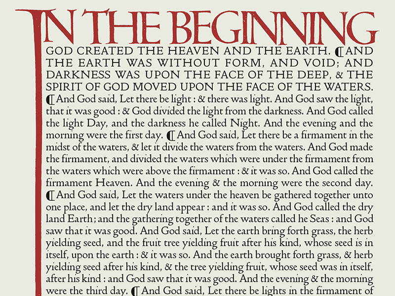
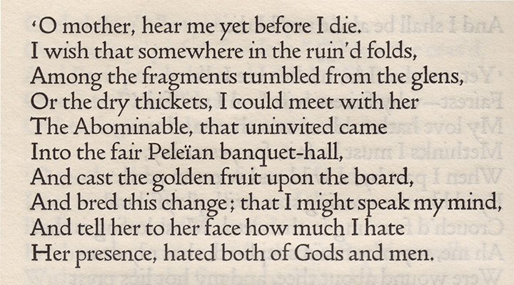
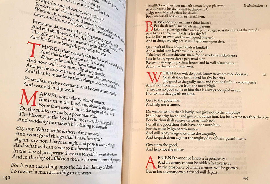
The Doves Press signalled a break with the fashion for decorative, overwrought facsimiles of Morris’s Arts and Crafts style. With exclusive use of the Doves Roman, as it became known, Cobden-Sanderson had a bedrock on which to build delicately detailed, spartan text layouts. Cobden-Sanderson’s understanding of where to emphasise natural pauses in the text dictated much of the typesetting, with judicious attention to line breaks and dynamic use of indentation. The strictness and monotony of undecorated black type contained within white space was relieved and enhanced by monumental headings and large initials, rendered calligraphically by Edward Johnston and printed, usually, in contrasting red ink. Johnston’s headings were reproduced in print from woodblocks or engravings by C.E. Keats and Eric Gill, or burnished in gold by Graily Hewitt on vellum copies, while initials were engraved or electrotyped in sets. In rare instances, Johnston was commissioned to write or ’flourish’ straight onto the printed pages in his own hand, on occasion enlisting the skills of former pupil Hewitt to help speed-up the task.
During its short life early last century, the Doves Press printed and bound some of the finest books ever produced in England and its approach to typography and printing subsequently exerted a major influence over book design in Europe and the United States. Many of Cobden-Sanderson’s ideas would, decades later, find expression or adaptation in both Traditionalist and Modernist circles respectively. The ‘transparent’ typography advocated by Beatrice Warde in her essay ‘The Crystal Goblet’ was paralleled by an evolution into the functionalism of Jan Tschichold’s ‘Die Neue Typographie’ and the Bauhuas in Germany.
But dramatically in 1916, having tossed the punches and matrices into the Thames three years earlier, Cobden-Sanderson began the systematic destruction of the entire Doves Press fount. He had embarked on his ‘adventure’ — some would say crime — to deny Walker the portion of type promised him when the partnership officially folded in 1909. Walker had effectively ceased to be involved in the Press within a few years of its establishment. Aside from feeling his erstwhile partner had no right to it – after all, the Doves Press and its type were his idea and both had been financed by his wife Annie — Cobden-Sanderson would, by destroying it, prevent any future possibility of the type being commercially recast and used on a mechanised press churning out faux Doves Press books. By February 1917, having spent countless evenings clandestinely ‘dedicating and consecrating’ the type to the River Thames, 76 year-old Cobden-Sanderson had thrown more than a ton of lead type over Hammersmith Bridge.
The Doves Roman, so everyone believed, was lost forever.
Written by Robert Green.
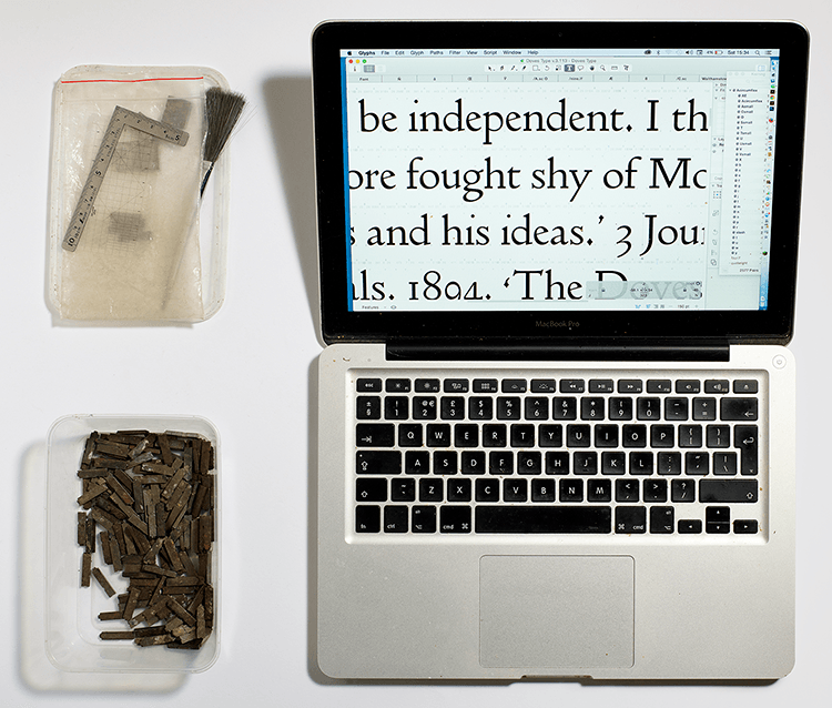
Green’s digital restoration of the famously lost Doves Roman, The Doves Type®, is available to purchase. An updated Doves Type® Regular, released in January 2015, came after Green’s discovery of a portion of the original metal Doves type in the Thames, replacing the initial Imprint weight which was first available back in 2013.
In 2016, Green undertook further work to improve the digital font for contemporary usage. This latest release of the updated Doves Type® contains extended glyph coverage including small caps, together with both lining and tabular figures. Purchase a Licence to use the font here.
Also on this site:
• Recovering the Doves Type
• Doves Type Revival
Further reading:
• Economist: The Fight Over The Doves
• Sunday Times: X Marks The Spot
• BBC News: One Man’s Obsession With Rediscovering A Lost Typeface
• The Doves Press by Marianne Tidcombe